MLS uniforms: Our Top 10

TOP 10 MLS Soccer Uniform

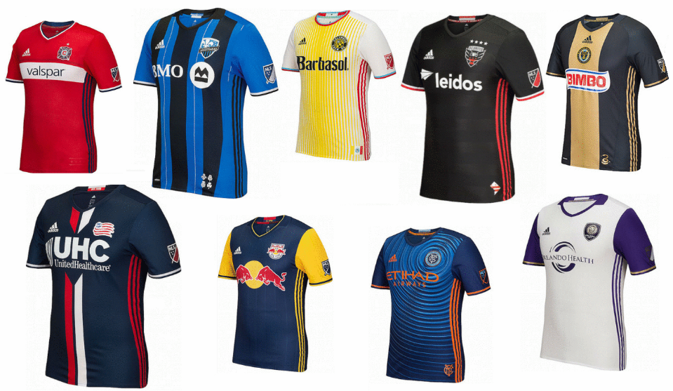
Never mind looking at the real standings. As a sports uniforms store, we have no shame in merging the east and west together and creating our own top 10! See below for our favorite uniforms in the MLS this season.


10. New England Revolution

Best MLS Uniforms

Even though this looks a lot like Paris St Germain, there is method to this. The club says the stripes are in reference to the Revolutionary War that their name descends from.


9.New York City FC

Best MLS Uniforms

They’ve certainly ripped up the rulebook with this one. They’ve done well with the circles rippling out from the crest, and the bold orange works really well with the background.


8. Real Salt Lake

Best MLS Uniforms

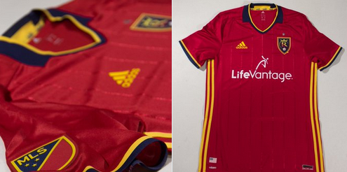
This is way better than their 2015 effort. As with all Adidas kits this season, the three stripes that went down from the shoulders have been removed. Now we see a much sharper kit. The understated pin stripes look really cool, as do the little flecks of navy and gold.


7. D.C. United

Best MLS Uniforms

A brand-new crest is complimented well by a whole new home kit. The ghosted hoops are a big hit and the flashes of white work really well too.


6. Philadelphia Union

Best MLS Uniforms

Union has been brave in trying to incorporate the snake from their logo into the design of the whole kit, but they’ve pulled it off in brilliant style. They’ve managed to keep the classical theme of the gold stripe down the middle, and yet at the same time, innovated.


5. Chicago Fire

Best MLS Uniforms

Fire make a welcome return to their white band across the middle, which has been sadly lacking in the last few seasons. It looks so much better than the navy scheme they’ve adopted recently. New sponsors Valspar have come in at the right time!


4. San Jose Earthquakes

Best MLS Uniforms

The home kit remains unchanged but we’ve gotta commend the tweaks they’ve made to the away kit this term. The vertical read stripe running down from the shoulders looks really cool, and the little throwback clash logo on the collar is a nice touch.


3. Vancouver Whitecaps

Best MLS Uniforms

When the Whitecaps brought this out there was one heck of an online frenzy, and you can see why. The way the ocean fades up to the Vancouver mountains is so clever.


2. Sporting Kansas City

Best MLS Uniforms

It’s nice to see a nod and a wink to the original Wizards shirt with those sky-blue horizontal stripes. And that henley collar looks slick!


1. Portland Timbers

Best MLS Uniforms

Doesn’t every kit look that bit better when it’s got a star on it? But this is about more than just a shiny yellow object. The shaded hoops are absolutely excellent – top marks for those!

If you liked this article then check out our very own Baseball logos standings here.

FC Barcelona vs Real Madrid

Atletico Madrid vs real madrid

One of the most anticipated rivalries to exist in sports, soccer clubs FC Barcelona and Real Madrid have gone head-to-head in matches that date as far back as the 1930s. In the last ten years alone, the two teams have faced each other 56 times, Barcelona leading victories with 23 versus Real Madrid’s 17. There is no doubt that the rivalry exudes passion and controversy, and with renowned, perhaps infamous, players like Lionel Messi and Cristiano Ronaldo, how can it not?

Critics often analyze Barcelona and Real Madrid by their players and matches, but we’re taking a refreshing approach by creating a more in-depth discussion on their uniforms. Yes, their uniforms! For most teams, the fundamental value of uniforms is to create a sense of community—to foster an identity with said community and establish who’s who, both on and off the field.

Here’s our quick uniform breakdown of FC Barcelona versus Real Madrid:

FC Barcelona stays true to their roots, and it shows, what with the traditional stripes they’ve boasted since the early 1900s. From their classic look down to their crest, Barca (short for FC Barcelona) shows rich history and formidable intent. Today, Barca’s current jersey offers a collar with a v-shaped accent and colors that represent the Senyera flag. Barca’s uniforms are, in essence, not just uniforms; they are symbols of history, strength and determination.

Like FC Barcelona, Real Madrid represents history on their bodies and, consequently, onto the field. Unlike FC Barcelona, however, Real Madrid’s look is more simple and perhaps less daunting to the eye. Their black-and-white jerseys are traditional but not boring. We were excited to see a shift in their look this past year when they added a rugby-like collar, creating clean lines for the jersey’s neckline and the team’s overall appearance.

While we can’t deny both FC Barcelona and Real Madrid’s uniforms speak volumes of their own, Real Madrid’s uniforms take the cake with their minimal look that still makes a big impact on the field. The rugby collar looked beautiful on France’s kits at the 2014 World Cup and continues to have the same effect through their shirts. With recent trends heading toward minimalism and simplicity, Madrid was able to adapt and represent their own sense of community through a simplistic beauty.

Which uniforms do you prefer: FC Barcelona or Real Madrid? Tell us in the comments below.