USC at Stanford, Sept. 17 – College Football Matchup

College football matchup 2016

During his first season as permanent coach, Clay Helton led USC to a discouraging, if not anticipated, defeat against the defending national champion, Alabama, in Arlington, Texas. Then, the following week, Helton and the team were met with a Week 3 trip to The Farm. With road games against Arizona, Utah, Washington, and UCLA following their game against Stanford, a 1-2 start will likely lead to concern over Helton’s capabilities.

Related: The History of USC’s Football Uniforms

Last year, Stanford beat USC in a 41-22 Pac-12 championship game, during which Christian McCaffrey amassed 461 all-purpose yards. McCaffrey will now be up for his first Heisman showcase opportunity. The Stanford-USC game may be a cross-division matchup, but it also marks a key stretch for Stanford, who will then travel to UCLA and Washington. If the Cardinals want to prove that they are a contender for the playoffs and the Pac-12 favorites, a win in this game is a must.

As a side note, another key college football matchup and custom football jersey to watch for in 2016 is Florida at Tennesse

NFL Throwback Jerseys: Our Top 10

Top 10 NFL Jerseys throwback

We all love a good throwback jersey. Whoever thought up the idea of those AFL legacy jerseys for the 2009 season deserves a medal. Never has the throwback been better served! Thankfully there is still some fine retro quality out there today, but now we’re going to give a rundown of our top 10 throwback custom football jerseys of all time.

Chicago Bears: The 40s

NFL Throwback Jerseys

The Bears have always been a bit of a retro team in many ways. Whatever their current uniform happens to be, it always looks like a classic. But still, this 1940s throwback is always a welcome change. And in order to get round the draconian NFL rules on helmets, they make their throwback look that bit more authentic by dropping the decals from their regular-season helmets.

San Diego Chargers: 1963

NFL Throwback Jerseys

This one went down so well when they brought it back that it didn’t take long for it to become the official alternate jersey for the organisation. So does this actually count as a throwback? Well seen as it looks so darn good, we’ll make an exception!

Washington Redskins: 1994

NFL Throwback Jerseys

This is a great uniform, and never better than when they first reintroduced it in 2012. It was only in 2012 that they were allowed to use the helmets with a matte finish that made them look like real leather. For whatever reason the NFL then decided to prevent any teams from changing their helmet during the season, so they were then forced to wear the retro jersey with their modern-day helmets. Sacrilege!

LA Rams: The 80s

NFL Throwback Jerseys

Now the Rams have moved back to LA, it is a good time to be talking about a throwback jersey. This was a lot more bright and colourful than the Rams’ recent regular season efforts. And the added bonus is that whatever the NFL helmet police might try, the current helmets go well with the retro jersey, so no harm done.

Dallas Cowboys: The 60s

NFL Throwback Jerseys

This is all about the simplicity. It doesn’t try too hard. And the blue star atop the cream helmet just looks so darn classy! Sadly, the Cowboys were only able to wear it a few times before the NFL put their size 9s on banned the use of throwback helmets during the season. It didn’t deter the Cowboys from rocking it out with their current helmets though – they’re still doing it to this day.

Philadelphia Eagles: 1979

NFL Throwback Jerseys

The bright green and white gives a really crisp look. It’s timeless as much as it’s retro.

Atlanta Falcons: The 90s

NFL Throwback Jerseys

It feels a bit rough on the 1966 jersey to not have that on the list. It’s better than most of the other throwbacks in the NFL, but unluckily it is pipped at the post by the Falcons’ effort from the 90s. The modern-day jersey isn’t all that different actually, but the reverse of colors is so so effective.

New England Patriots: 1984

NFL Throwback Jerseys

The proliferation of red kinda makes this retro jersey more patriotic. There just seems to be more glory in the red. The overall feel of the Patriots uniform hasn’t changed much down the years, but this reversal of color is most welcome.

Buffalo Bills: 1965

NFL Throwback Jerseys

This is all about the bison on the helmet. That standing bison seems so much better than the modern-day charging bull. The rest of the uniform is pretty similar to the Bills jersey of today, so this is yet another retro effort that has been blunted by the NFL’s outlawing of alternate helmets. It has made the standing bison a thing of the past, and not a thing of the past that you’re able to bring back on special occasions!

Houston Oilers: The 80s

NFL Throwback Jerseys

You can still see loads of these being rocked out at Tennessee Titans home games. It’s not as if the franchise only just moved over either…it’ll be 20 years this year since the Oilers ceased to be the Oilers, but the sentiment about this jersey remains. The oil platform was always an iconic image, and those hints of red really help bring the look to life.

Looking for custom football team jerseys? Uniform Store specializes in the design and supply of team uniforms for all major sports!

MLS uniforms: Our Top 10

TOP 10 MLS Soccer Uniform

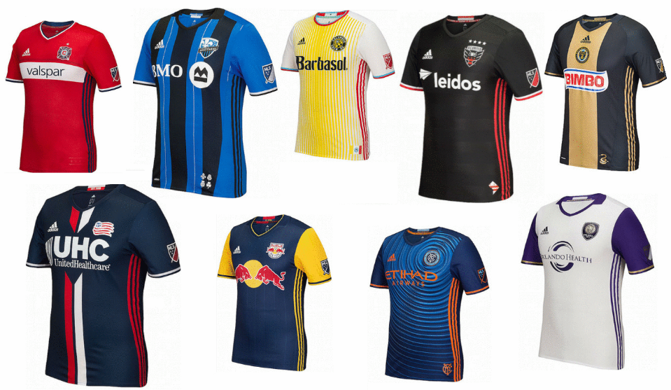
Never mind looking at the real standings. As a sports uniforms store, we have no shame in merging the east and west together and creating our own top 10! See below for our favorite uniforms in the MLS this season.


10. New England Revolution

Best MLS Uniforms

Even though this looks a lot like Paris St Germain, there is method to this. The club says the stripes are in reference to the Revolutionary War that their name descends from.


9.New York City FC

Best MLS Uniforms

They’ve certainly ripped up the rulebook with this one. They’ve done well with the circles rippling out from the crest, and the bold orange works really well with the background.


8. Real Salt Lake

Best MLS Uniforms

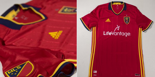
This is way better than their 2015 effort. As with all Adidas kits this season, the three stripes that went down from the shoulders have been removed. Now we see a much sharper kit. The understated pin stripes look really cool, as do the little flecks of navy and gold.


7. D.C. United

Best MLS Uniforms

A brand-new crest is complimented well by a whole new home kit. The ghosted hoops are a big hit and the flashes of white work really well too.


6. Philadelphia Union

Best MLS Uniforms

Union has been brave in trying to incorporate the snake from their logo into the design of the whole kit, but they’ve pulled it off in brilliant style. They’ve managed to keep the classical theme of the gold stripe down the middle, and yet at the same time, innovated.


5. Chicago Fire

Best MLS Uniforms

Fire make a welcome return to their white band across the middle, which has been sadly lacking in the last few seasons. It looks so much better than the navy scheme they’ve adopted recently. New sponsors Valspar have come in at the right time!


4. San Jose Earthquakes

Best MLS Uniforms

The home kit remains unchanged but we’ve gotta commend the tweaks they’ve made to the away kit this term. The vertical read stripe running down from the shoulders looks really cool, and the little throwback clash logo on the collar is a nice touch.


3. Vancouver Whitecaps

Best MLS Uniforms

When the Whitecaps brought this out there was one heck of an online frenzy, and you can see why. The way the ocean fades up to the Vancouver mountains is so clever.


2. Sporting Kansas City

Best MLS Uniforms

It’s nice to see a nod and a wink to the original Wizards shirt with those sky-blue horizontal stripes. And that henley collar looks slick!


1. Portland Timbers

Best MLS Uniforms

Doesn’t every kit look that bit better when it’s got a star on it? But this is about more than just a shiny yellow object. The shaded hoops are absolutely excellent – top marks for those!

If you liked this article then check out our very own Baseball logos standings here.

Florida at Tennessee, Sept. 24 – College Football Matchup

College football matchup 2016

While he may have led Florida in their eleventh straight win against Tennessee, that accomplishment was about the only one achieved by Jim McEwan during his first season with FSU.

The rivalry between the two teams has waned ever since the Vols beat the Gators several years and four coaches ago. Tennessee’s program has seen its fair share of recent changes, especially with Butch Jones looking to steadily improve the zoos programs. Does it surprise anyone that their football uniforms are so different this year?

Insider Look: Tennessee’s Football Uniforms Impress

Stephen Curry Basketball Jersey Sales Soar

Stephen curry jersey

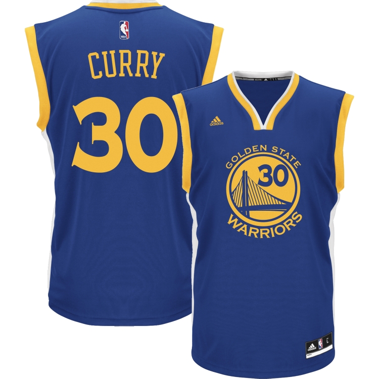
2016 looks like another year where Stephen Curry and Golden State Warriors wins everything in sight. Although the playoffs aren’t done yet, we can bring news of a resounding victory for both of them in the uniforms sales stakes.


NBAstore.com reports that Curry was the NBA’s most popular player jersey, while the Warriors topped the team merchandise list, making them some of the most popular sports uniforms out there. The lists make for interesting reading (see below for top 15 player jerseys and top 10 team merchandise).


Special mention should go to Kristaps Porzingis who goes straight in at number 4. He sure is in some illustrious company in that list, rubbing shoulders with Curry, LeBron James, Kobe Bryant and Kevin Durant in the top 5. It’s been a truly incredible effort for a rookie to make such a commercial impact so quickly. Another notable debutant in the list is Jimmy Butler of the Chicago Bulls.


The main movers in the list were Kobe Bryant (up three places, probably helped by the nostalgia trip in the wake of his retirement announcement), and the Thunder duo of Kevin Durant and Russell Westbrook each went up an impressive six places. As a result, we’ve seen orders for our Tempo Basketball Jersey skyrocket!


No real surprise in the top 5 for the teams, with the Warriors being followed by the Bulls, Cavaliers, Lakers and the Knicks.


Most Popular NBA Jerseys: Top 15

  1. Stephen Curry, Golden State Warriors
  2. LeBron James, Cleveland Cavaliers
  3. Kobe Bryant, Los Angeles Lakers
  4. Kristaps Porzingis, New York Knicks
  5. Kevin Durant, Oklahoma City Thunder
  6. Derrick Rose, Chicago Bulls
  7. Russell Westbrook, Oklahoma City Thunder
  8. Kyrie Irving, Cleveland Cavaliers
  9. James Harden, Houston Rockets
  10. Jimmy Butler, Chicago Bulls
  11. Klay Thompson, Golden State Warriors
  12. Paul George, Indiana Pacers
  13. Anthony Davis, New Orleans Pelicans
  14. Chris Paul, L.A. Clippers
  15. Carmelo Anthony, New York Knicks


Most Popular Team Merchandise: Top 10

  1. Golden State Warriors
  2. Chicago Bulls
  3. Cleveland Cavaliers
  4. Los Angeles Lakers
  5. New York Knicks
  6. San Antonio Spurs
  7. Oklahoma City Thunder
  8. Miami Heat
  9. Boston Celtics
  10. L.A. Clippers

If you had to design custom basketball uniforms for your next season of play, which NBA team which you want your look to resemble?

Related: Kobe Bryant Must Choose 8 or 24 As Retirement Jersey Number

Posted in NBA

Which Major League Baseball Team Has the Best Logo?

MLB Sport Uniform

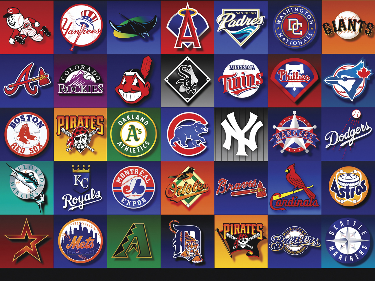
The logo is arguably the most important part of any sports uniform, so as the 2016 MLB season heads towards the end of the first month, we give you our top logos for 2016. Some have innovated and done something new, while some have stayed unashamedly old school. Wherever your team sits in the rankings, it’s always an interesting debate. Who is going to take the crown this year?

  1. St Louis Cardinals

Everyone just loves the Cards identity. You can’t knock it! Those birds on the bat are utterly fantastic. They’ve been part of the St Louis uniform since 1922, so why break a habit of a lifetime? Thankfully they haven’t, and this exact logo has remained constant since 1998. Long may it continue!


  1. Los Angeles Dodgers

This logo is genuinely iconic – it kinda speaks for itself. Quite right that it basically hasn’t changed for decades and decades. They have done the odd little tweak, like bolder lines on the baseball, but this logo is gonna run and run.

  1. New York Yankees

This is one of the classics, recognizable the world over. Completely untouched since 1968, and for good reason! The Yankees might be the reason we receive requests for pin striped baseball jerseys.

  1. Minnesota Twins

Although the logo is like many others in that it features two letters, the Minnesota Twins have a slightly different take on it, because the letters don’t stand for the team name. They actually stand for “Twin Cities”, and although the two letters were used during their World Series glory years, they’ve been spruced up a little bit to bring them into the modern era. Hopefully this doesn’t ruin their chances of any future World Series!

  1. Houston Astros

The Houston Astros have enjoyed some good times of late, and their logo looks good too. It was a good move for them to reinterpret their old cap logo to give us the logo we see today. This was brought in when they joined the American League a few years ago, and looks kinda neat; far better than the old black and brick theme anyway.

  1. Detroit Tigers

This has recently been upgraded to become the primary logo, a decision that has been well received by the public. The logo was actually first seen in 1905, and has been worn on their cap on-and-off ever since.

  1. New York Mets

The New York skyline is always an evocative image, and it never looks better than when emblazoned on the Mets logo. It hasn’t changed much in the last 50 years which is perhaps a sign that it looks right.

  1. Toronto Blue Jays

The Blue Jays have basically overhauled their entire identity, thanks in no small part to the protestations of the fans. They insisted on pressing for more blue, and basically wanted the logo to look more like it did when they were successful. What’s for certain is that it’s wildly more popular than their last logo, which caused widespread outcry.

  1. Kansas City Royals

The crown on the logo has been particularly appropriate in recent years, but it’s been going right from the beginning when they entered the league (1969). This current version was adapted in 2002, where they added a black drop shadow and emphasized the “KC” part of it. Why change a winning formula?

  1. Seattle Mariners

You can’t argue with a franchise called “the mariners” using a compass in their logo – that’s a nice touch. There’s a fair bit of momentum behind a return to the 1980s blue and yellow, but the teal look seems to work at the moment.

  1. Chicago Cubs

The Cubs are a franchise steeped in history, so it’s right that the logo has remained pretty similar down the years. The design concept goes as far back as 1937, and it hasn’t even been tweaked in the slightest since 1979. It seems even more relevant now that the team is looking good.


  1. Arizona Diamondbacks

Despite being such a new franchise, there have been so many changes in their logos and colors. Well now is the time to stop – the current Sedona and black looks mighty fine.

  1. Atlanta Braves

Would you believe it was 1990 when they dropped the Native American logo? Was it screaming? Was it laughing? We can all remember the debate! But it looks like their tomahawk logo is very much here to stay… there is a chant about it after all.

  1. Oakland Athletics

You’ve really gotta love that elephant on the arm of the uniforms, especially when you consider the back story. In case you don’t know already, it was an ironic response to a taunt from the New York Giants owner John McGraw in 1905 who described the franchise as a “white elephant”. The 1993 revamp of the green outline of the logo is still looking sweet.

  1. Los Angeles Angels Of Anaheim

They’ve gone through a lot of changes down the years, but the current ‘A’ with an angel’s halo around the top is a very nice touch. This came in when the team was renamed in 2005, and is still a big hit.

  1. Colorado Rockies

Those Rocky Mountains look great on the logo, but the logo itself is in that time window where a franchise normally changes it. It’s been unchanged since 1993. The question is, will they stick with it long enough for it to become an icon?


  1. Chicago White Sox

This is straight up black & white and hasn’t changed for 25 years. It’s actually a version of a logo they originally used in the 1960s. It leads us to wonder; how much longer are they going to stick with it? There’s been a bit of a resurgence in the Batterman logo from the 1980s, so maybe just maybe they’re priming it for a logo change sometime soon.


  1. San Francisco Giants

This was the logo they brought in when they first moved to San Francisco, and it’s still looking the part today. Black, gray and orange is a unique color combo that works really well. Or maybe it was winning those three World Series in six years that persuaded us it was good?

  1. Baltimore Orioles

This is one of those where you either love it or you hate it. The bird is kinda funny, but you see just as much of the older cartoon bird from back in the day, which suggests not everyone sees the funny side.

  1. Boston Red Sox

The Red Sox are a classic franchise but there’s a bit of friction about their logo. The red socks have been there for a long time, but what about the circle and baseball from many years ago? Might be worth bringing back.

  1. Miami Marlins

This is a bit different. The logo has an interesting color scheme and the Marlin jutting out from the ‘M’ is a nice touch, but for now it will be in the shadow of the Florida Marlins logo.

  1. Washington Nationals

This logo doesn’t really inspire, but it’s a damn-sight better than their rushed rebrand from a few years ago.

  1. Milwaukee Brewers

The logo is a bit bland, let’s be honest. The primary logo just doesn’t seem to have the class of the ball-in-glove logo that they use on their second uniform.

  1. Philadelphia Phillies

Isn’t this beginning to look a little bit dated? Although this variation has only been going since 1993, and there are plenty of logos that go back longer than that, it’s probably time for a new look.

  1. Cincinnati Reds

This is a fairly uninspiring logo. Props to them for adding the black to it recently though – it lifts things slightly.

  1. Pittsburgh Pirates

What were they doing relegating their pirate logo to be their alternative? Sacrilege!

  1. Cleveland Indians

Their official “C” mark is pretty dull, but in their defense, the mark most people associate with them is the better-looking-but-now-deemed-offensive Red Indian logo.

  1. Texas Rangers

Their logos have always been poor. This one sure needs jazzing up a bit.

  1. San Diego Padres

It was a big mistake to get rid of their classical Swingin’ Friar, especially when the alternative is as simple as this. Must do better!

  1. Tampa Bay Rays

Even though the team was fantastically bad, the Devil Rays logo they wore at the time was far better than this current effort.

From the best to the worst; you’ve now seen our review of the styles and uniforms of every MLB team. To order and design your very own custom baseball uniforms, contact Uniform Store today.

The Top 20 NBA Twitter Accounts

NBA twitter accounts

There’s something about the NBA that brings out some of the best Twitter has to offer.

Major League Baseball has some pretty hilarious players on Twitter too but the NBA has so many that we needed a top 20 list.

So here they are, the top 20 NBA Twitter accounts you must follow!

Chris Bosh (@chrisbosh)

Chris Bosh has a refreshing ability to laugh at himself. Check out all the ridiculous photos of himself.

J.R. Smith (@TheRealJRSmith)

Always considered a bit of a character, JR’s feed is always worth a look.

LeBron James (@KingJames)

18.5 million twitter followers! Need we say more?

Atlanta Hawks (@ATLHawks)

This is the best team twitter account out there.

Jamal Crawford (@JCrossover)

This guy talks real sense, and he seems to really care about his fans too.

Kobe Bryant (@kobebryant)

Kobe Bryant is one of the biggest tweeters in the world, and who could forget that tweet battle with Mark Cuban?

Blake Griffin (@blakegriffin32)

Blake Griffin is just a naturally funny guy, and his feed is every bit as funny.

Kevin Durant (@KDTrey5)

Durrant is developing a bit of a reputation for calling people out. No NBA writer is safe. Even the rapper Lil B felt the wrath of his keyboard.

Chris Kaman (@ChrisKaman)

You’ve got to love all of his chat about hunting. And he was on point when he said he wished he could hunt Katy Perry’s mythical beast from the Superbowl.

Joel Embiid (@JoelEmbiid)

Thanks to his ‘association’ with Rihanna, Embiid was a twitter sensation before he’d even taken a shot in the NBA.

Dirk Nowitzki (@swish41)

This is a well-travelled man right here. You can see him talking about sport across the world in both English and German, and if you’re lucky, free tickets for Mavs games.

Chris Paul (@CP3)

Chris Paul’s got to have the cutest kid in the NBA. In amongst his NBA commentary, keep an eye out for his little one on Instagram. 

Pau Gasol (@paugasol)

You won’t see any trolling from Gasol – he’s one of the more balanced commenters you’ll see on twitter. And he tweets in Spanish too!

Mark Cuban (@mcuban)

The Dallas Mavericks owner sure pulls no punches!

Nick Young (@NickSwagyPYoung)

This guy has no shame, but it’s kinda interesting to keep tabs on his outlandish lifestyle.

Damian Lillard (@Dame_Lillard)

Not a shrinking violet, Lillard is good value for calling out trolls.

Roy Hibbert (@Hoya2aPacer)

An unashamed geek, Hibbert doesn’t fit your average profile for an NBA star, and that’s why he’s worth following.

Stephen Curry (@StephenCurry30)

The number one shooter in the game is worth a look, if nothing else for his exchanges with Warriors fans.

JaVale McGee (@JaValeMcGee34)

Not afraid to retweet himself, McGee is generally good value.

Phil Jackson (@PhilJackson11)

Just like his Knicks career, Jackson’s opening forays into social media were up and down, but now he’s hit his stried.

Posted in NBA

Top Youth and Little League Baseball Bats Reviewed

cold steel baseball bal

Researching the best youth baseball bats and baseball uniforms can be a real minefield – there are just so many different sites out there and so many different opinions. Good news: we’ve done a load of research for you. Even better news: we’ve put our findings in this article, and to make it even easier, we’ve picked our top three youth baseball bats.

By the end of the article, you’ll understand why they are so popular and what the main features are that your child might benefit from. Then you can make an informed decision. Remember, the habits of a batter are forged from a young age, so it’s vital to get the bat right from the beginning.

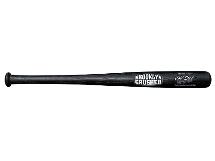
Our best all-rounder: Cold Steel Brooklyn Crusher review

cold steel baseball bal

We like this one because it’s basically unbreakable. Bats breaking in competitive play is a disappointingly regular occurrence, but if more people used bats like this, then it wouldn’t be. As well as being expensive to replace, broken bats can also be a dangerous thing on a baseball field, so the benefits of having this almost-indestructible bat are not to be underestimated.

This really is the bat for all seasons. It would be ideal for practicing or competition. The Cold Steel Brooklyn Crusher is 29” long, and weighs in at 2lbs 1 ounce. It has a sleek look as well to match those custom designed baseball jerseys

Easton YB14S500 Review

The best thing about the Easton YB14s500 is the weight. Made from aircraft alloy, this feels nice and light, but it packs enough of a punch for some mega hits.

The luminous green contrasts brilliantly with the gray and black – it really oozes class in every department. And you can customize the length… anything from 27” to 32”.

Louisville Slugger MLB225YB Youth Wood Baseball Bat Review

Wood bats can be a bit of a risk because the quality of the wood can change so much, but Louisville Slugger have been well-known for the quality of their wood for many years.

They always use Maple, which is a closed grain wood, similar in structure to laminated bats. It’s also more firm on the surface than Ash, which is commonly used for bats. This is important because it reduces the risk of splintering. The Louisville Slugger MLB225YB also comes in multiple lengths, ranging from 26” to 31”.

Youth Baseball Bats Explained

It’s easy to be over-awed by the amount of choice that is out there in the youth baseball bat market. We’ve put together an easily digestible guide which will give you all you need to know about youth baseball bats.

The evolution of baseball bats

First, a little history lesson. The first baseball bats can be traced back to the 1850s, long before a time where there was mass production of anything, so they tended to be homemade, fashioned from any material available.

It was 1859 when they brought in the rule which stipulated that bats couldn’t have a diameter any larger than 2.5”, and by 1869 it was insisted that bats could be no longer than 42”. The length rule still stands today.

It’s generally acknowledged that the first commercial bat was the Louisville Slugger, in 1884. The story goes that the Louisville player Pete Browning broke his bat during the game, and a 17-year-old in the crowd named John Hillerich offered to make him a replacement.

Hillerich took Browning to his father’s woodworking shop, and Browning proceeded to select a piece of white ash and supervised the whole process of the making of the bat. With new bat in hand, Browning then ended up going three for three the next day! This was enough to create a lot of demand for Hillerich and his father to make other bats for people, and so the Louisville Slugger was born.

The metal bat was first invented and patented in 1924, but it was 1970 before it was ever actually used on the open market. Metal bats have become more and more popular in junior and amateur baseball, but wood bats are still the choice for professional players.

We’re currently in the age of the Maple bat, thanks in no small part to Barry Bonds championing the Maple bat during his record-breaking 2001 season.

The aspects of a bat

Barrel:

This is where the ‘sweet spot’ for hitting can be found. The longer the barrel, the bigger the sweet spot, but also, the heavier the bat is. There’s always a trade off between having a big enough sweet spot to get the batter out of jail if they mishit the ball, or having a smaller barrel/sweet spot that makes for a lighter bat and a faster swing.

Grip:

Grips can be leather, synthetic leather or rubber. This is the area that covers the handle.

Taper:

Taper basically means the diameter of the bat’s handle. The wider it is, the less shock for the player when the bat hits the ball. Again, there is a trade off with weight. A smaller taper would allow for better bat speed and wrist rotation.

Bat types

There are several different materials that a bat can be made out of, each with their own pros and cons. To make the right choice, it’s important to first understand what level you are playing at. As we will discuss, some bats suit junior play better than competitive play.

Aluminum:

Aluminum bats are lighter than wooden bats, so this makes them ideal for junior ball. Many leagues have them as standard, because they allow the kids to swing hard and really go for it.

Another advantage of aluminum bats is that they don’t require breaking in like wooden bats do.

Composite:

These are the lightest bats out there, because they are made up of fiberglass, graphite and resin. These tend to have the largest sweet spots of all bats, and they’re well balanced too. They can take a bit of getting used to, so be prepared for a long break-in.

Wood:

These are rarely used in little leagues, but they do still have some benefits. Wooden bats can be customized more than any of the others, i.e. the taper can be adjusted to a player’s swing and they are good for teaching young players proper swing form from an early age. The disadvantages of wood bats are that they have a long break-in period, they have smaller sweet spots, and they can often break.

Bat standards

Across all materials, youth baseball bats are measured in terms of length, weight and drop. Length and weight is self explanatory, but drop is defined by subtracting the weight of the bat from the length. Smaller drops are for power swingers, while longer drops offer greater swing speed.

Find the right length and weight

It figures that bats will need to be longer for taller batters, and that as youth players get older, they will need longer bats.  Below is a rough age/length guide:

5-7: 24”-26”

8-9: 26”-28”

10-11: 28”-30”

11-12: 30”-32”

13-14: 31”-32”

15-16: 32”-33”

17+: 34”

To find the right weight, there is a good test you can do. Ask the batter to hold the bat to the side at shoulder height for 10 seconds, and if they can’t keep their arm straight, then the bat is too heavy.

Bat cost

Bats can range from $25 all the way up to $200 and more, but be careful: just because a bat is expensive doesn’t mean it’s the right bat. Make sure you take in all the factors that have been mentioned in this article before making a decision. Only then should you consider the price.

Other equipment

Although not all of the following items are mandatory, they are an important part of the mix.

Bags:

This can preserve the life of any bat because bags protect bats from marks and potentially breaks.

Helmets:

Quite rightly, helmets are compulsory in city and school leagues. Protecting players’ heads is clearly important, but even more so at junior level when the standard of pitching can vary so much.

Gloves:

Any help that players can get in gripping the bat is generally worth it, because even a small slip can turn a home run into a mishit. They are also useful in protecting the batter’s hands and fingers.

And finally…

Remember, a bat can shape the way a child plays for life, so you should really take seriously the many different issues discussed in this article. Good luck!

10 of the Best Baseball Twitter Accounts

top 10 baseball twitter accounts

You can always rely on Twitter to provide entertainment when your team isn’t playing. In our top 10 list we have everything from the random political crusades of MLB pros to the parody account of a dead pitcher from the 1880s.

1). Brandon McCarthy (@bmccarthy), Dodgers pitcher, 168K followers

This man is one hell of a character. Only Brandon McCarthy would be able to blatantly call out an umpire’s performance while comparing to the ultra trendy play of NBA star, Steph Curry. 

Of course Brandon’s wife is similarly just as amusing.

2). MLB Cathedrals (@MLBcathedrals), 61.2 K followers

This is great for all the nostalgia hunters among us. There are some great photos of baseball uniform and old ballparks you may have forgotten, as well as some photos of today’s arenas.

3). Old Hoss Radbourn (@OldHossRadbourn), 70.9K followers

This is absolute genius – one of the funniest baseball accounts you’ll ever see. Old Hoss Radbourn was a pitcher and rightfielder who played in the 1880s and died in 1897, and yet miraculously, here he is on Twitter! This really is a great parody account – you can imagine the kind of fun you can have with an alter ego from the turn of the century.

4). Joe Posnanski (@jposnanski), NBC Sports writer, 111K 

This guy is poetic – his way with words is unbelievable. One of the best sports reporters out there.

5). John Thorn (@thorn_john), official MLB historian, 11.5K followers

This is great for baseball history. John Thorn has access to all-things historic, like photos and newspaper cuttings, which he shares regularly.

6). MLB Jersey Numbers (@NumbersMLB), 5.6K followers

This account is quite simple – it’s about jersey numbers. It tracks who’s wearing what number and who may have worn that number in the past. 

As we specialize in custom baseball uniforms, we appreciate this!

7). Jon Heyman (@JonHeymanCBS), CBS Sports insider, 360K followers

Jon Heyman realy is on point. He’s great for breaking news and he’s insightful about the sport. Well worth checking out.

8). SABR (@sabr), Society for American Baseball Research, 24.9K followers

The SABR are some serious operators. In recent years they’ve mostly been associated with Sabermetrics that determine the baseball statistics that truly matter, but they are about a lot more than just that.

9). Chipper Jones (@RealCJ10), former Braves infielder, 476K followers

Just look at how many followers he’s got – the most on this list by a mile. You just don’t know what he’s going to say next, but it’s likely to be a conspiracy theory!

10). Dan Haren (@ithrow88), Marlins pitcher, 12.8K followers

Haren’s a funny guy. He only pops up every so often but it’s normally worthwhile.

2016 NBA Rumors: Jeff Teague on the Move?

Basketball jersey on sale

The 2015-16 NBA trade deadline is drawing closer, which means we can expect to hear a lot more about guys potentially being on the move. One big name that has popped up recently in NBA trade rumors is Atlanta Hawks star point guard, Jeff Teague. Whether it’s been inconsistency, rest or injury, Teague has seen his minutes and production drop this season and that reportedly has him on the trading block.

The Hawks aren’t stopping at Teague, either, as they don’t appear to be content with how their point guard situation has unfolded and could also be looking to deal Dennis Schroder. It could be an “either/or” situation, but the odd man out due to age and his decline for the moment seems to be Teague. While Teague hasn’t exactly worked out as expected this year, he has been good for quite a while and still looked the part of an NBA starting point guard earlier this season. Numerous teams could use an upgrade at the position and could come calling for Teague’s services. Let’s take a look at the most likely landing spots if Teague in fact gets dealt:

Milwaukee Bucks

Jason Kidd has run through some point guards in Milwaukee and although Michael Carter-Williams has been better lately, it’s rather likely he’s still not done moving pieces around. MCW can pass and rebound, but he’s not the best defender and he’s a flat out abysmal shooter. Teague would be a much more balanced option and it’s plausible to imagine a player for player swap.

Utah Jazz

Utah continues to roll with Trey Burke off the bench as a pure scorer, which tells us they don’t really envision him as a franchise point guard. The drafting of Dante Exum told us that last year, but he’s since torn his ACL. If the Jazz want to make a playoff push this year, they’d be trying to do it with Raul Neto starting and Burke as a pure scorer off the bench. Giving up on Burke may be in order and instead they could roll with Teague. Teague would give them a balanced starter that can play both ways and also would allow Exum the time he needs to come back at the right pace next season.

New York Knicks

Jerian Grant could still be the future but the one key thing the Knicks have lacked all year is a suitable, top shelf point guard who can shoot, pass and defend. Grant has shown flashes but overall has been too inconsistent and the aging Jose Calderon can’t defend or create much. Calderon can stroke it from deep, but he’s got to be on his way out. Unless the Knicks are sold on Grant taking over the team soon or have their eyes on another trade candidate, perhaps they should consider luring Jeff Teague to the Big Apple.

Brooklyn Nets

Brooklyn let Deron Williams walk for nothing this past summer and then settled on a very average Jarrett Jack at the point. Jack was fine enough as the starter, but he recently tore his ACL and isn’t a lock to be ready for the start of next season. At the moment Donald Sloan and Shane Larkin are all the Nets have and it’s pretty likely that’s all they want as they try to lose games en route to a high draft pick in the 2016 NBA Draft. If they want to try to win this year, though, they probably will want to swing a trade for a better point guard. Teague would give them the big name they lack and could help make their entire roster a little more cohesive.

Houston Rockets

Houston is the only other team in the league that isn’t sure what they want to do at the point and trading for what figures to be an upgrade could be an option. They have two different yet in their own way suitable options in Ty Lawson and Patrick Beverley. Lawson can’t defend and that’s largely all Bev can do. Teague can both score and defend and if Houston sees it right, he could be the answer to their on the surface issues. They’re the least likely of the five, but they deserve mentioning.

Think Teague gets traded to one of these five teams or stays put? Tell us in the comments below!

Posted in NBA