The logo is arguably the most important part of any sports uniform, so as the 2016 MLB season heads towards the end of the first month, we give you our top logos for 2016. Some have innovated and done something new, while some have stayed unashamedly old school. Wherever your team sits in the rankings, it’s always an interesting debate. Who is going to take the crown this year?
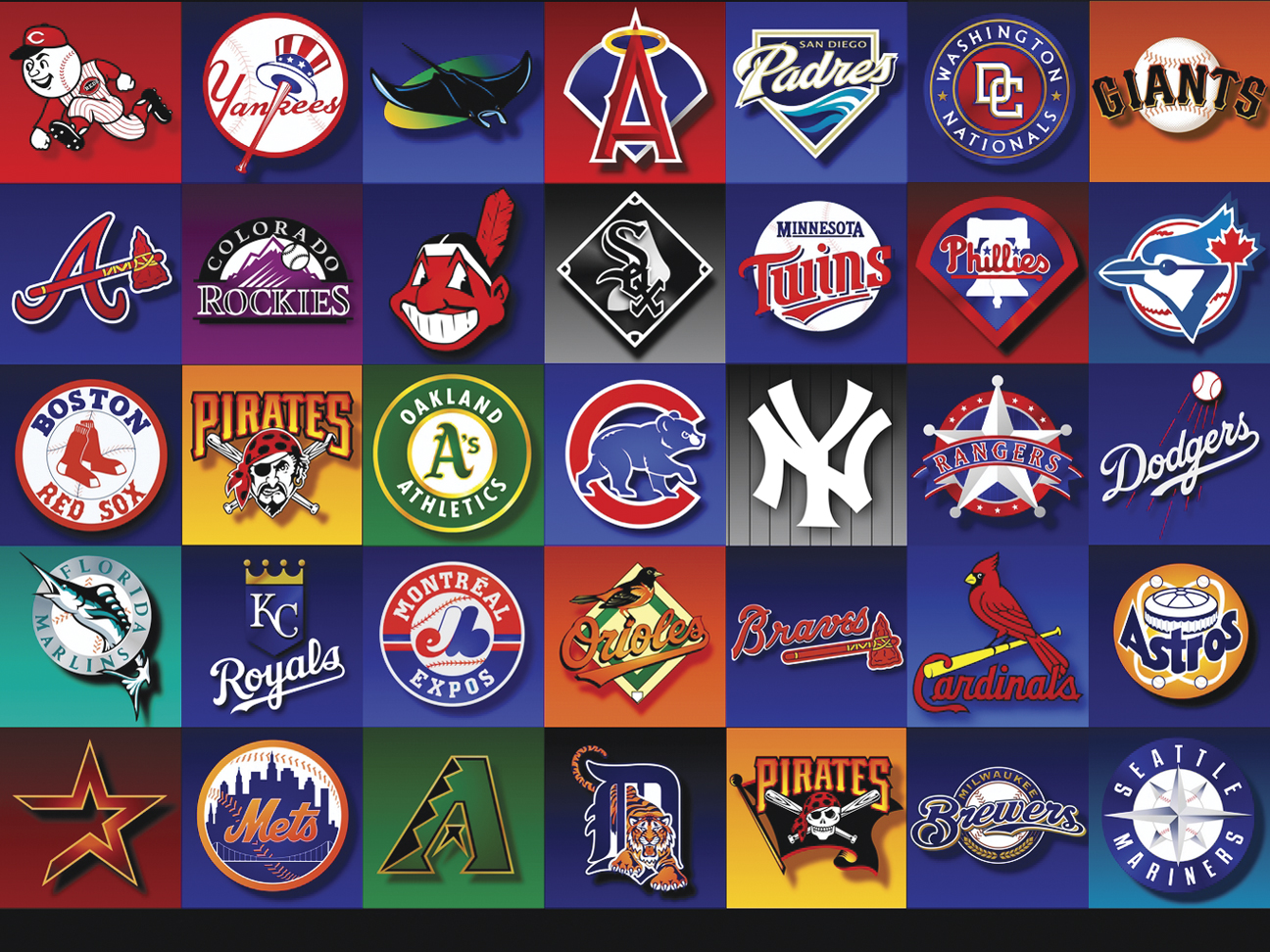
Everyone just loves the Cards identity. You can’t knock it! Those birds on the bat are utterly fantastic. They’ve been part of the St Louis uniform since 1922, so why break a habit of a lifetime? Thankfully they haven’t, and this exact logo has remained constant since 1998. Long may it continue!
This logo is genuinely iconic – it kinda speaks for itself. Quite right that it basically hasn’t changed for decades and decades. They have done the odd little tweak, like bolder lines on the baseball, but this logo is gonna run and run.
This is one of the classics, recognizable the world over. Completely untouched since 1968, and for good reason! The Yankees might be the reason we receive requests for pin striped baseball jerseys.
Although the logo is like many others in that it features two letters, the Minnesota Twins have a slightly different take on it, because the letters don’t stand for the team name. They actually stand for “Twin Cities”, and although the two letters were used during their World Series glory years, they’ve been spruced up a little bit to bring them into the modern era. Hopefully this doesn’t ruin their chances of any future World Series!
The Houston Astros have enjoyed some good times of late, and their logo looks good too. It was a good move for them to reinterpret their old cap logo to give us the logo we see today. This was brought in when they joined the American League a few years ago, and looks kinda neat; far better than the old black and brick theme anyway.
- Detroit Tigers
This has recently been upgraded to become the primary logo, a decision that has been well received by the public. The logo was actually first seen in 1905, and has been worn on their cap on-and-off ever since.
- New York Mets
The New York skyline is always an evocative image, and it never looks better than when emblazoned on the Mets logo. It hasn’t changed much in the last 50 years which is perhaps a sign that it looks right.
- Toronto Blue Jays
The Blue Jays have basically overhauled their entire identity, thanks in no small part to the protestations of the fans. They insisted on pressing for more blue, and basically wanted the logo to look more like it did when they were successful. What’s for certain is that it’s wildly more popular than their last logo, which caused widespread outcry.
- Kansas City Royals
The crown on the logo has been particularly appropriate in recent years, but it’s been going right from the beginning when they entered the league (1969). This current version was adapted in 2002, where they added a black drop shadow and emphasized the “KC” part of it. Why change a winning formula?
- Seattle Mariners
You can’t argue with a franchise called “the mariners” using a compass in their logo – that’s a nice touch. There’s a fair bit of momentum behind a return to the 1980s blue and yellow, but the teal look seems to work at the moment.
- Chicago Cubs
The Cubs are a franchise steeped in history, so it’s right that the logo has remained pretty similar down the years. The design concept goes as far back as 1937, and it hasn’t even been tweaked in the slightest since 1979. It seems even more relevant now that the team is looking good.
Despite being such a new franchise, there have been so many changes in their logos and colors. Well now is the time to stop – the current Sedona and black looks mighty fine.
- Atlanta Braves
Would you believe it was 1990 when they dropped the Native American logo? Was it screaming? Was it laughing? We can all remember the debate! But it looks like their tomahawk logo is very much here to stay… there is a chant about it after all.
- Oakland Athletics
You’ve really gotta love that elephant on the arm of the uniforms, especially when you consider the back story. In case you don’t know already, it was an ironic response to a taunt from the New York Giants owner John McGraw in 1905 who described the franchise as a “white elephant”. The 1993 revamp of the green outline of the logo is still looking sweet.
- Los Angeles Angels Of Anaheim
They’ve gone through a lot of changes down the years, but the current ‘A’ with an angel’s halo around the top is a very nice touch. This came in when the team was renamed in 2005, and is still a big hit.
- Colorado Rockies
Those Rocky Mountains look great on the logo, but the logo itself is in that time window where a franchise normally changes it. It’s been unchanged since 1993. The question is, will they stick with it long enough for it to become an icon?
- Chicago White Sox
This is straight up black & white and hasn’t changed for 25 years. It’s actually a version of a logo they originally used in the 1960s. It leads us to wonder; how much longer are they going to stick with it? There’s been a bit of a resurgence in the Batterman logo from the 1980s, so maybe just maybe they’re priming it for a logo change sometime soon.
- San Francisco Giants
This was the logo they brought in when they first moved to San Francisco, and it’s still looking the part today. Black, gray and orange is a unique color combo that works really well. Or maybe it was winning those three World Series in six years that persuaded us it was good?
- Baltimore Orioles
This is one of those where you either love it or you hate it. The bird is kinda funny, but you see just as much of the older cartoon bird from back in the day, which suggests not everyone sees the funny side.
- Boston Red Sox
The Red Sox are a classic franchise but there’s a bit of friction about their logo. The red socks have been there for a long time, but what about the circle and baseball from many years ago? Might be worth bringing back.
- Miami Marlins
This is a bit different. The logo has an interesting color scheme and the Marlin jutting out from the ‘M’ is a nice touch, but for now it will be in the shadow of the Florida Marlins logo.
- Washington Nationals
This logo doesn’t really inspire, but it’s a damn-sight better than their rushed rebrand from a few years ago.
- Milwaukee Brewers
The logo is a bit bland, let’s be honest. The primary logo just doesn’t seem to have the class of the ball-in-glove logo that they use on their second uniform.
- Philadelphia Phillies
Isn’t this beginning to look a little bit dated? Although this variation has only been going since 1993, and there are plenty of logos that go back longer than that, it’s probably time for a new look.
- Cincinnati Reds
This is a fairly uninspiring logo. Props to them for adding the black to it recently though – it lifts things slightly.
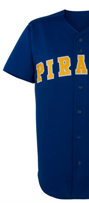
- Pittsburgh Pirates
What were they doing relegating their pirate logo to be their alternative? Sacrilege!
- Cleveland Indians
Their official “C” mark is pretty dull, but in their defense, the mark most people associate with them is the better-looking-but-now-deemed-offensive Red Indian logo.
- Texas Rangers
Their logos have always been poor. This one sure needs jazzing up a bit.
- San Diego Padres
It was a big mistake to get rid of their classical Swingin’ Friar, especially when the alternative is as simple as this. Must do better!
- Tampa Bay Rays
Even though the team was fantastically bad, the Devil Rays logo they wore at the time was far better than this current effort.
From the best to the worst; you’ve now seen our review of the styles and uniforms of every MLB team. To order and design your very own custom baseball uniforms, contact Uniform Store today.